A public trade company platform for helping beginners bootstrap their investment journey
Project Overview
Summary
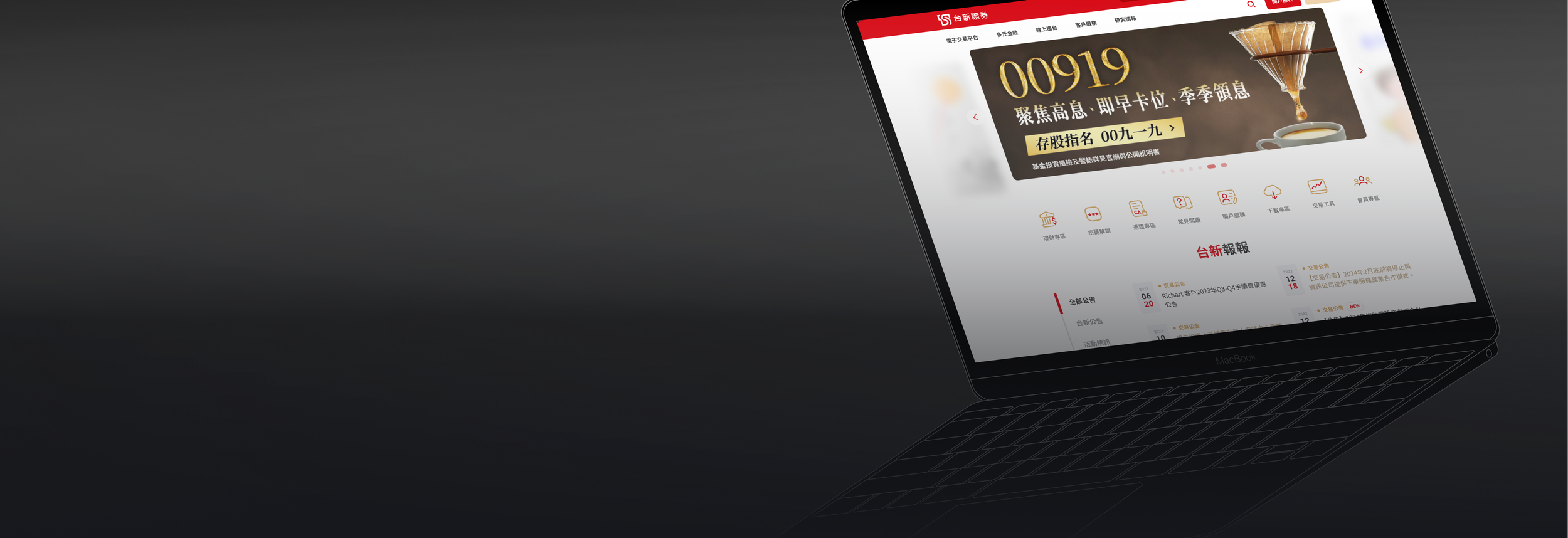
For this project, our client is a renowned Taiwanese public trade company, we collaborated with our client to improve their website which is focused on allowing local investors to participate in overseas stocks and futures markets.
Our work is part of a digitization plan, in which, our company was responsible for improving their official website. The project goal is to decrease the learning curve required for newcomers to participate in financial markets.
Team
Product Manager
UX Researcher
UX Designer
UI Designer
Front-end Developer
Back-end Developer
Deliverables
User Interview
Information Architecture
User Flow
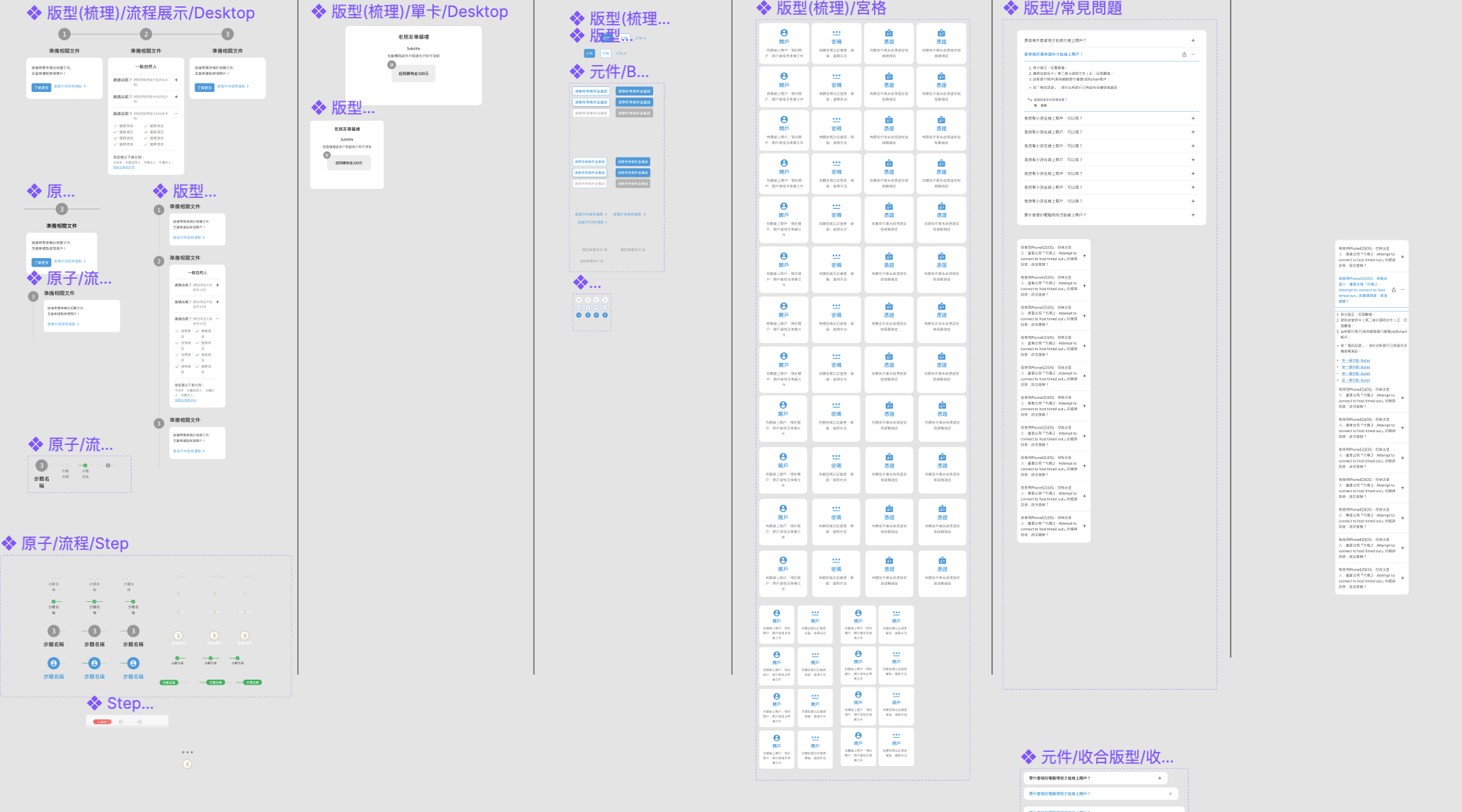
Wireframe
Interaction design
Design System
Usability Report
Project Details
Web Design
Aug 2021 - Feb 2022
Financial Industry
Role
UX Designer
Where to We Start ?
To establish the core values of our concept
The analysis consisted of numerous interviews with employees of the client company and crafting a wide range of low-fidelity wireframes, which we presented to various departments to verify our concept. These interactions are important for ensuring productive dialogue between us and the client company.

Me and my colleague use card sorting to define pages goal, and direction we need to discuss with customer.

Due to the Covid-19, our meeting are through video conference.
The customer’s core values:
Based on our client’s observation, the average age of investors has decreased. Therefore, they want to target the younger generation for their online platform.
Our client expects that the re-designed online platform can increase their user conversion rate, and the new user experiences can incorporate service orientation to help beginners bootstrap their investment journey.
Drawing conclusions from our data.
From our data:
We discovered that our main users are of the age range of 25 to 54, and have stable incomes.
From the data, we identified that the most accessed page is for opening accounts of the age range between 25 to 54. Therefore, this page became the main design focus.
On the website, the most commonly visited pages include branch information, investment tutorials, and downloads. We concluded that users visited function-orientation the most and related to users invest journey map process. Therefore in these function-orientation pages, we need more careful and avoid breakpoints.
More data info
Conclude the users thought and the design direction.
Summarize all customer and users’ needs, also we find potential in the website, So our design solutions are not just focused on solving problems and more on creating new possibilities.
The design target
As a User:
How might we design a product that makes our users feel confident and secure during their online financial transactions?
As a Client:
How might we let young investors consider our company as their first choice.
Design Solution
We use Google analytics to organize users most visit pages, and according to help beginner goal by
We try to lightweight incomprehensible financial information
Offer them thought reminders and easily contact with customer service.
Offer personalized marketing campaign in the product page and member center so we can provide users easy to accept marketing campaign.
As a UX/UI designer, know partners’ goals before getting your hands dirty.
Working in an agency, we need to face different perspectives of stakeholders, Besides, cooperating and communicating, we also need to convey design concepts and delivery processes to our clients to make our cooperation process more transparent.
4 approaches help us maintain the quality of the design in a limited time.
It is not an easy task to finish 300+ pages from gaol targeting to hand-off delivery in four months. We streamline the working process from design to real code to ensure quality design.
01. Created design guidelines for collaboration
We organized all the resources and set design principles for tone, user flow, user motivation, and stakeholder expectations. Guidelines can help designers to apply and maintain consistency.

02. Design system
I cooperated with the design team to establish a design system.We also considered mobile experiences to make our website on the phone more user-friendly.
03. Listen to user’s need
After producing different creative experiments we would verify by many users thought to prove it. We tried numerous rapid internal testing and two times usability tests.

04. Design critiques
As a designer, we would prepare the background and design files, and then involve the required stakeholders (PM, developer, researcher).

Our design should born to serve the needs of clients and customers.
According to interviews, data and persona, we had created a design principle, and hope to have it help us to make meaningful design decisions along with branding.
Decrease the learning curve
In this project, we would mainly focus on the younger generation, who tend to lack focus and don’t have many experiences in investment. For this, we colloquia led sentences on UX writing and simplifying information.
Content design
There is many regulations, specification, and other necessary information in the financial market. And we try to avoid users feeling frustrated when they can’t understand. So we would show the main information, and store less important information in UI design elements.
Elevate business value
Organize clients’ marketing campaigns to know how they interact with users, and we will make redesign pages layout to create better user experiences. Make marketing campaigns will easier to reach out to users to increase conversion rates. And we trying to know more about what is client’s profitable product, and how we can help by design.
Validate our design in the usability test.

When we transfer thought to wireframes, we had designed 400+ interactive prototypes, involving 8 participants to do usability tests.
Usability test goal
Can new invest beginners understand the information we have lightweight?
Listen to our user’s feedback to see if the design fits their needs on our main focus pages, branch information, tutorials, and downloads? (Data came from GA)
Is our design user-friendly for beginners. Can they understand complicated information and finished investing?
Is UX writing easy to understand?
How do users explore financial information?


The outcomes are significant and insightful. We’ve learned about validated, concerns, and opportunities. To continue developing a better product for our users, we defined the features that needed to be improved, prioritized, and updated in sprint planning.
Help our users and increase business value from redesign the platform.
Take away
Reasonable time limitations can help designers.
During the project, I switch my design philosophy to focusing on real problems, rapidly creating different solutions to listen to our user feedback, and polish the details.
If the UI design needs to explain to understand, it is not a finished design.
Designers will introduce design details while having design critiques. But in the real case customers use the platform without introducing it.
Feedback from my colleague
Ting inspires us with different opinions and ideas makes projects have novel perspectives. That offers big help. - UX researcher
Ting has a keen mind! She can easily get design directions. - Design Lead

Other Projects

Online ordering notification
Offer a variety of notification channels to ensure uninterrupted product usage

Productlife
A learning-oriented dating app that provides the fastest way to make new partners